Bland logo in white
drag
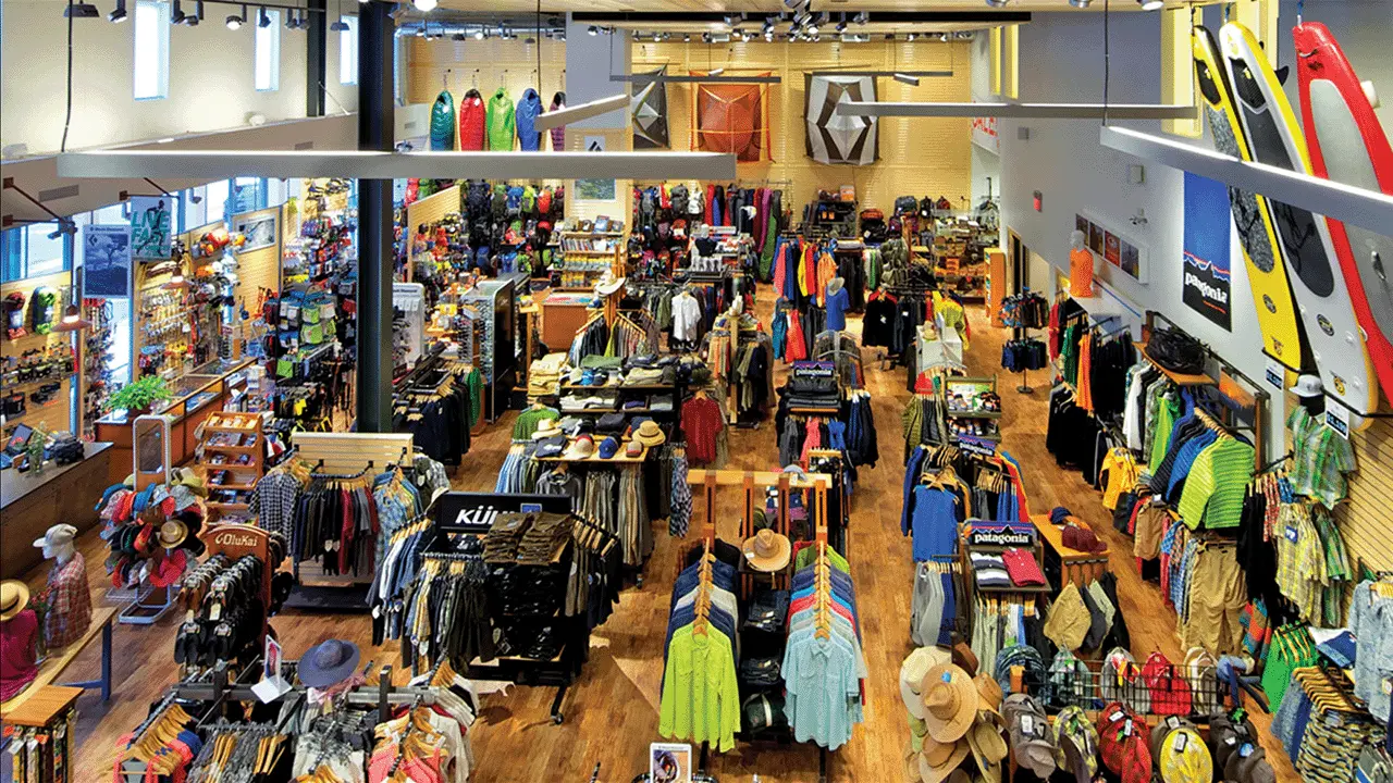
interior shot on outdoor retail store
Bristlecone Mountain Sports:

A retailer built for adventure

Client background

Nestled in the heart of Colorado ski country, Bristlecone Mountain Sports is one of the top independent outdoor retailers around. Their doors first opened 30 years ago, and with thousands of products from hundreds of vendors, they’ve been the first stop on everyone’s adventure for decades. From skis to tents to paddleboards, staff members are very knowledgeable of current products and have a breadth of expertise gained from lifetimes spent in the backcountry. They have leveraged this wisdom to great effect, as Bristlecone’s customer base continues to grow both within and outside the state. Their participation in the local community has also increased over the years to include partnerships with several charities, volunteer organizations and local businesses.

Highlights

- Business strategy & determination of key demographics
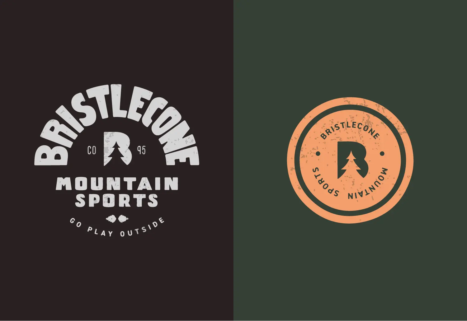
- Development & design of full identity system
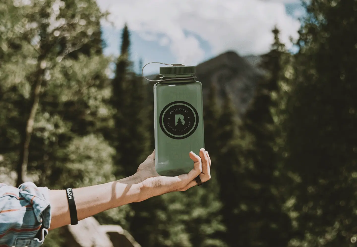
- Print & merchandise development & design
- Website design & development
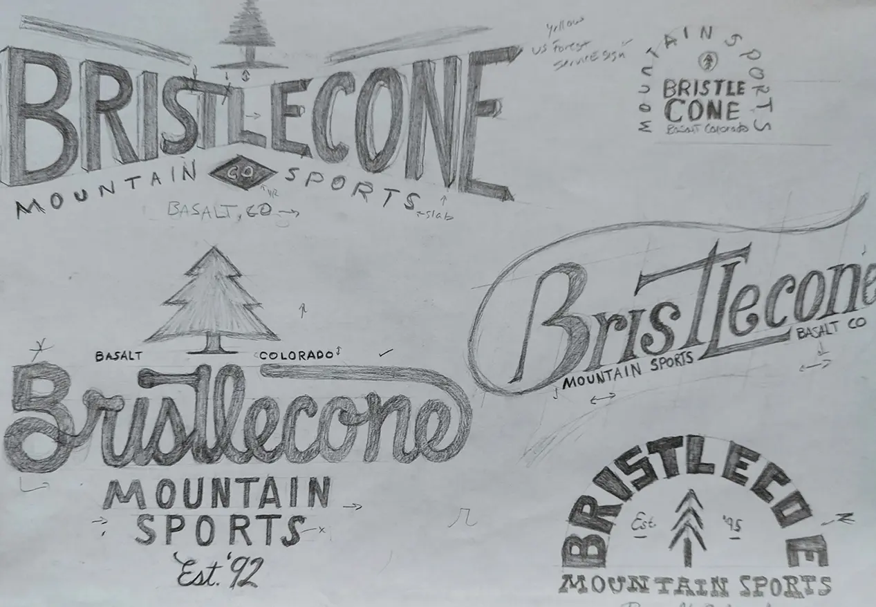
- Hand lettered logo & other assets

Services

Branding & ID Design
Graphic & Collateral
UX/Web

DRAG

branded canvas bag on map
outdoor magazine mockup
skier with backpack looking out over mountains
gift card mockup
man sitting on rock with branded sweatshirt
website mockup

Pain points to fix

After 30 years of business, Bristlecone had yet to update their logo. Due to its complexity, scaling the logo down for smaller applications was not feasible. Confusion extended to the rest of the company brand as well, resulting in limited branded merchandise and signage. Another concern was their website, which lacked ecommerce capabilities. A considerable portion of their customers are visiting from other states, and the inability to provide products and advice was a problem to be solved. Staff also expressed a need to arrange both product specs and their learned knowledge in a way that both they and the customers would benefit from.

The turn out

The process started with several business strategy exercises which allowed us to define and formalize Bristlecone’s values, customer profiles, brand look, feel, and voice. Next came a new identity system, including a redesigned logo, new color palette, and font pairing. Several pieces of branded merchandise followed, in addition to storefront decals and printed materials. Lastly, we ran a site audit on Bristlecone’s current website to determine the best method of improvement. After a new site map, we passed through several rounds of wireframing and prototyping to optimize user experience.