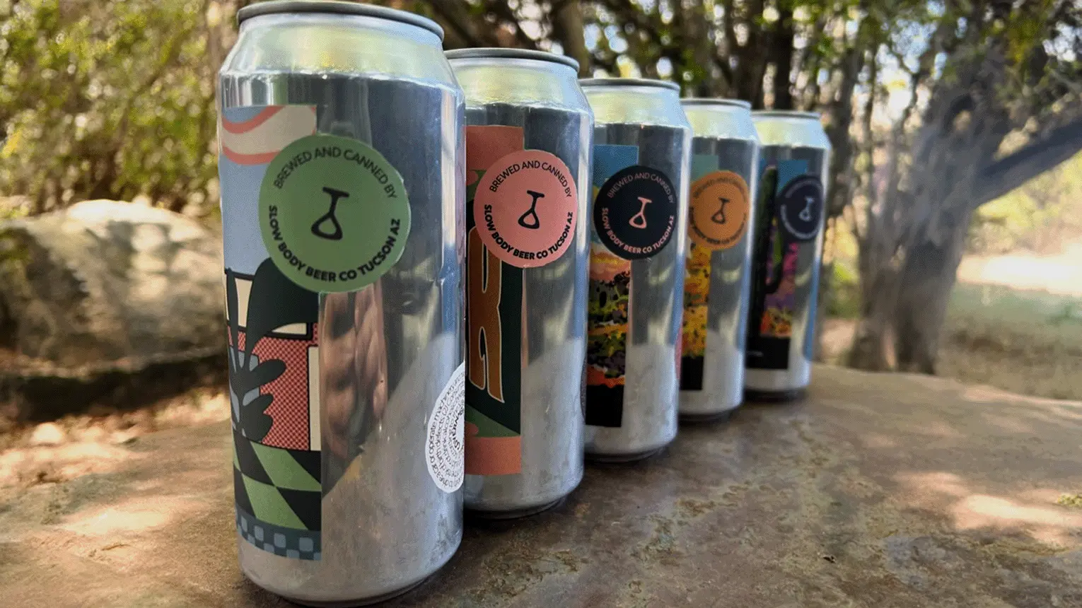
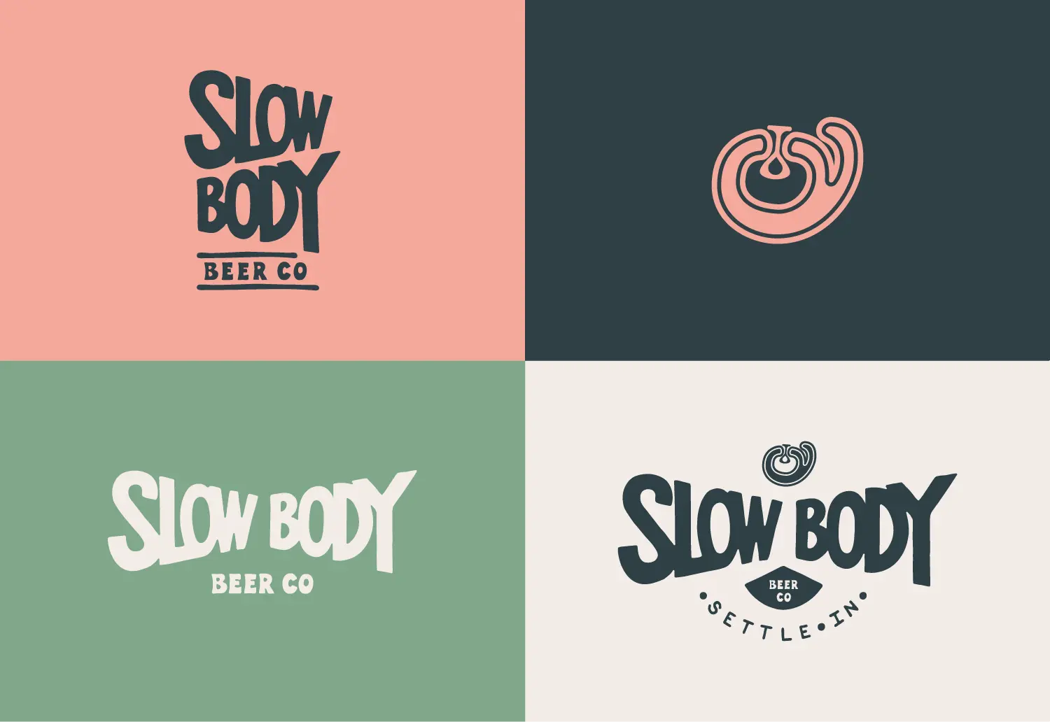
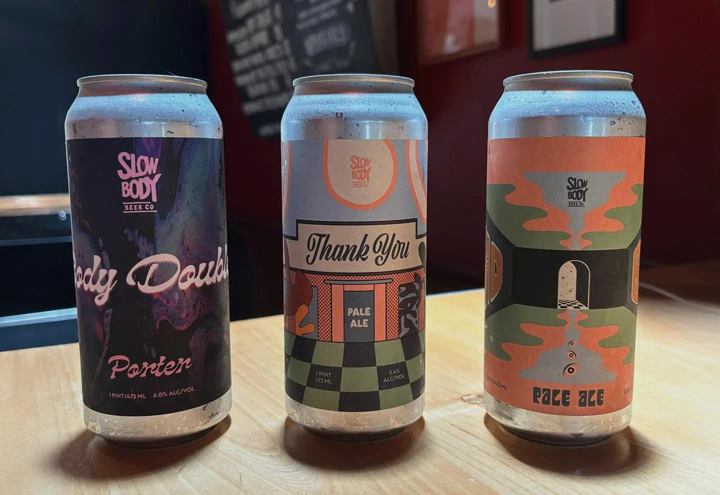
Bland logo in white
drag

Client background

Slow Body Beer Co is a young brewery and taproom that likes to do things the old way. They are obsessed with brewing the highest-quality craft lagers -- some of the oldest beers on record -- and they decided to open a microbrewery to share this lost tradition with their city. Retrofitted inside an historic meatpacking warehouse, the taproom and brewery are welcoming to any and all types of beer drinkers. A respite from the hectic world, the microbrewery is a step back in time, into the atmosphere of your grandmother's kitchen, where time passes slower and the world feels more delightfully mundane.

Highlights

- Business strategy & determination of key demographics
- Development & design of full identity system
- Menu, merchandise & packaging design & development
- Website design & development
- Hand lettered logo & other assets

Services

Branding & ID Design
Graphic & Collateral
UX/Web
Visit Site

DRAG

Front building facade with logo
taproom interior with tables and chairs
pen and pencil logo sketches
branded coaster with pint glass
branded hat among plants
16 oz cans lined up outside on table

Pain points to fix

Slow Body needed a full identity system in addition to brand development and messaging. Key design components needed to be finalized and delivered in time for the grand opening. Product packaging was also a top priority as the team was eager to distribute their beers to the public. Print collateral such as beer menus and taproom signage needed to be worked through because the Slow Body team wanted to prevent guests from becoming overwhelmed by information. Lastly, design and development of a marketing website was important for the brewery to connect with guests, display current beers on tap, and provide important information.

The turn out

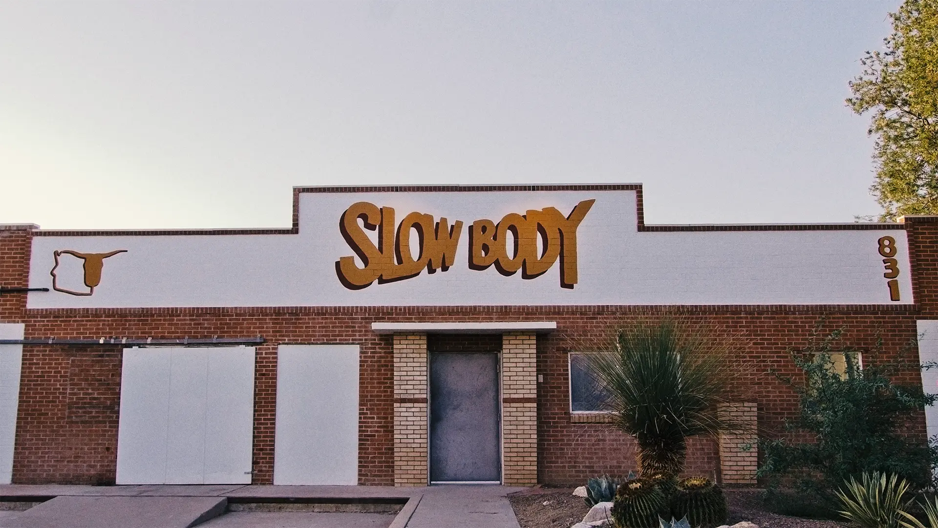
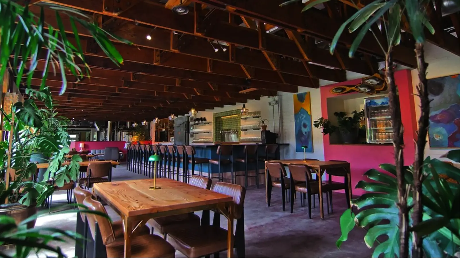
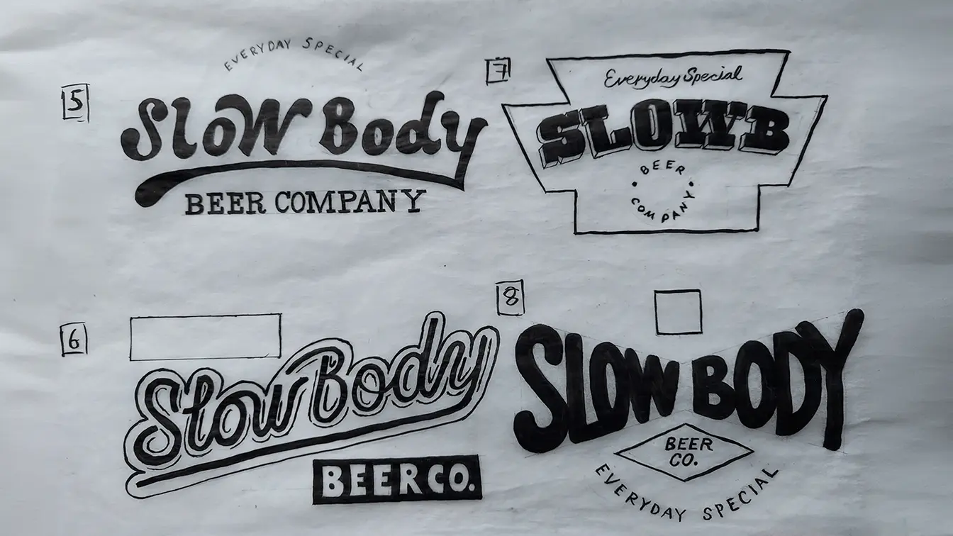
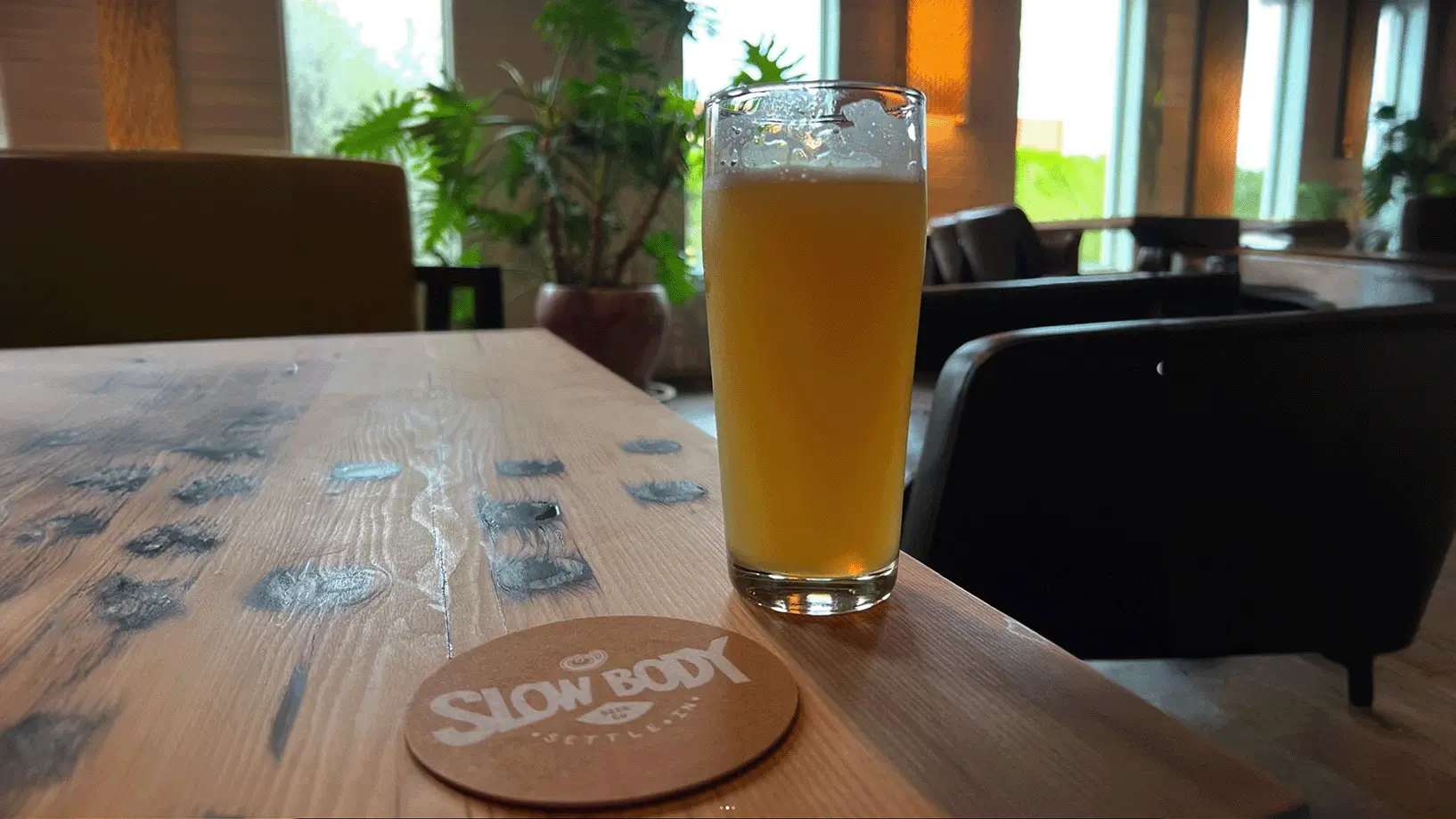
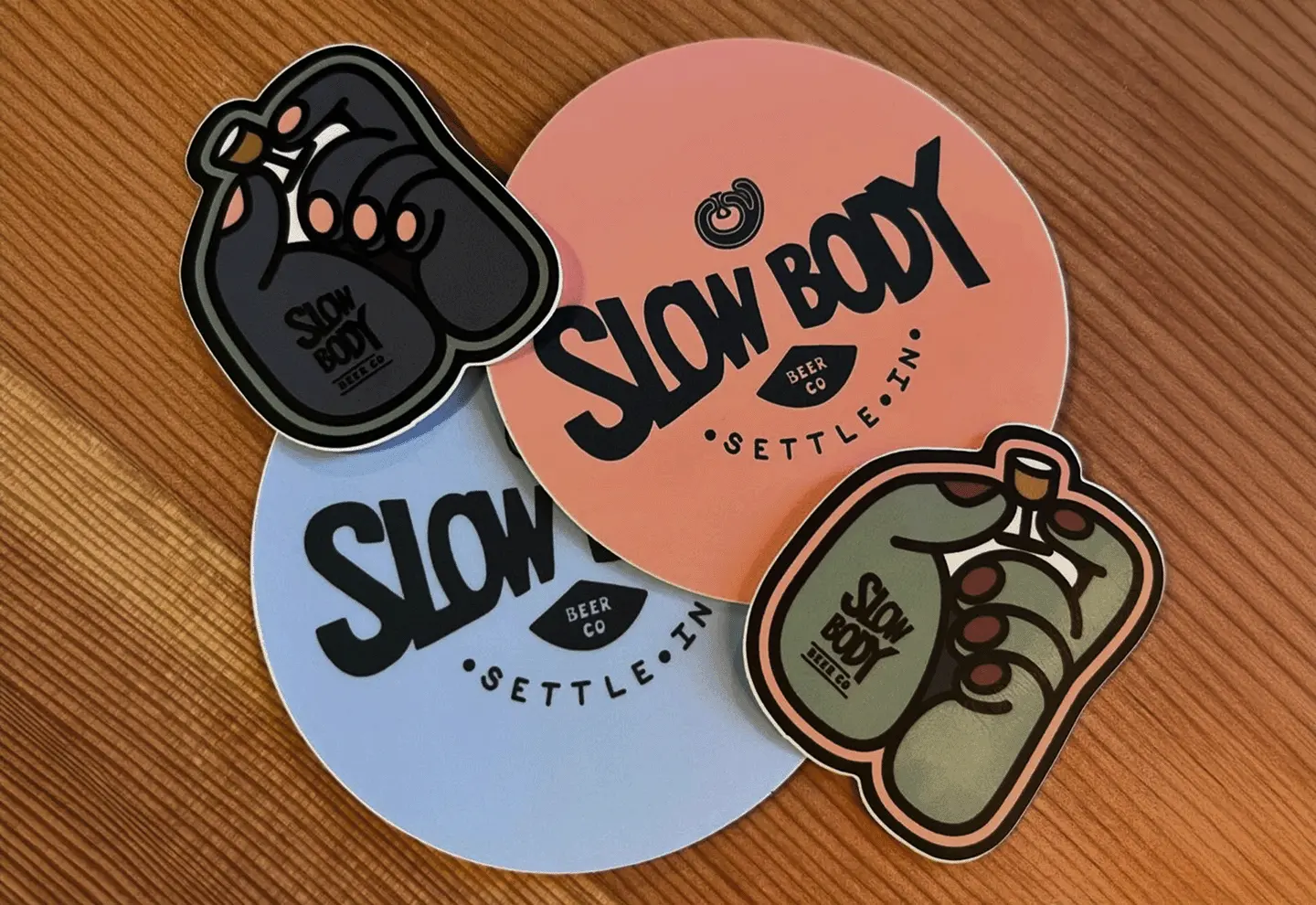
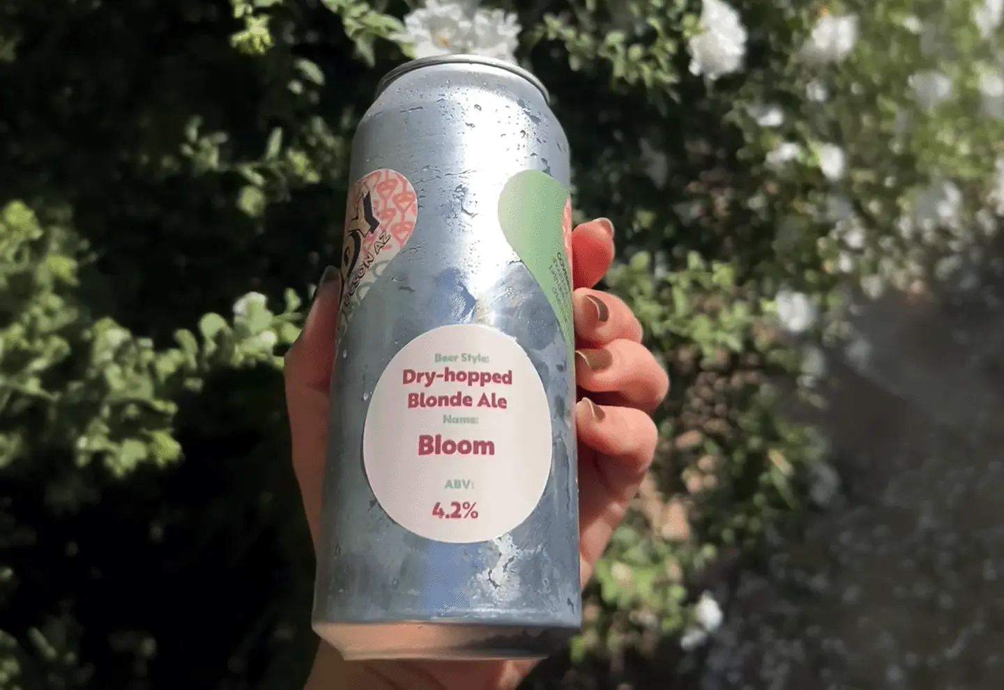
We worked to refine and formalize brand strategy, create customer profiles, and craft the right brand voice and messaging. After several rounds of stylescapes, we delivered a modular identity system in which assets scaled consistently and legibly. Packaging design began with a market audit that helped find the correct look and feel. Website considerations, starting from user needs and objectives, came next. We developed and launched the site after rounds of site maps, wireframes, and prototypes.